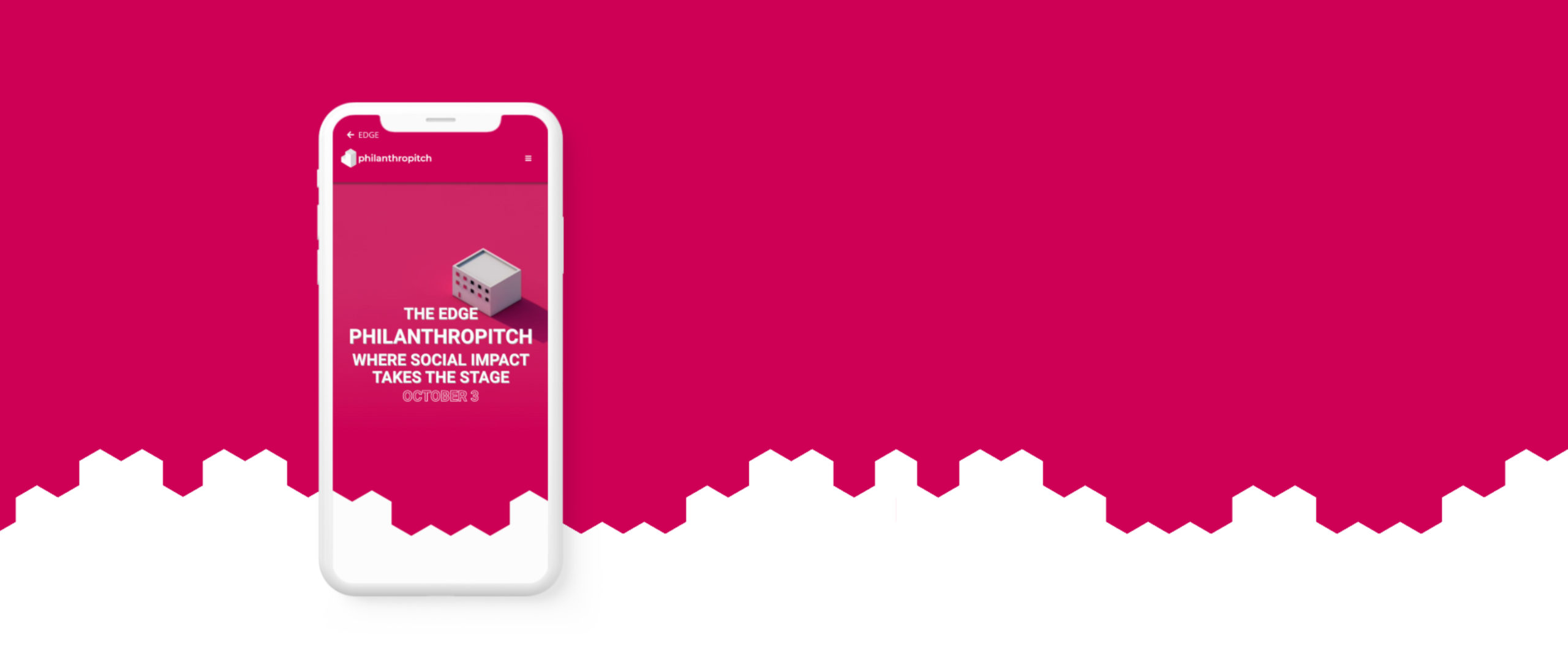
EDGE Philanthropitch
OVERVIEW
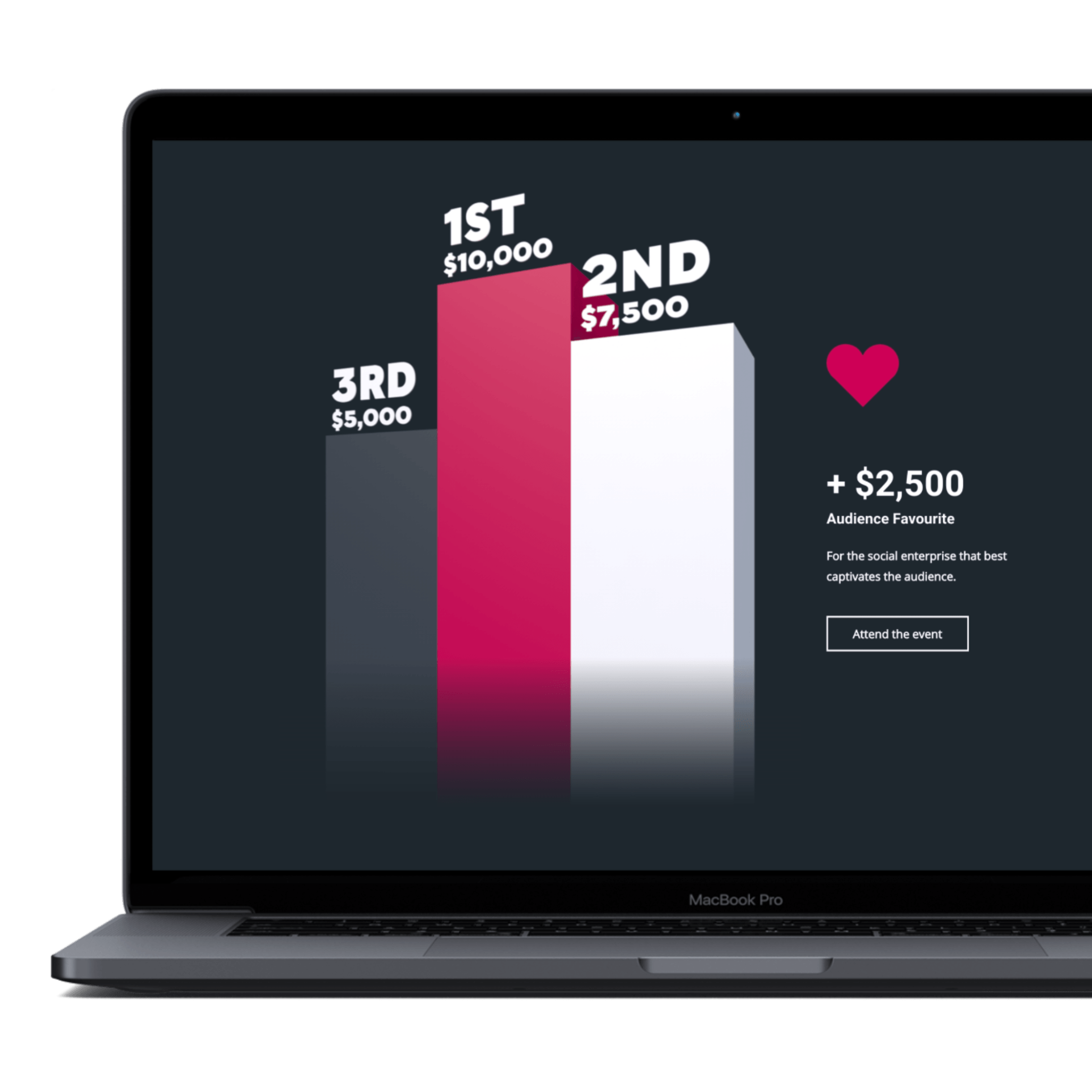
A website and logo design for The EDGE Philanthropitch; an event that gave social entrepreneurs the opportunity to pitch for their share of $25,000.
TOOLS
Adobe Illustrator
Adobe XD
Cinema 4D
HTML & CSS
Javascript
TIMELINE
JUNE 2019
4 WKS
JULY 2019
MY ROLE
UX/UI Design
Prototyping
User Testing
Web Development
Branding
TEAM
JP AUGURUSA
BRITTANY TAPPER
Challenge
While working for EDGE, Sheridan's Entrepreneurship Discovery & Growth Engine, my team and I were tasked with creating a visual identity and website to promote The EDGE Philanthropitch; a pitch event centred around social impact and community building.
Solution
A landing page and logo, consistent with, but separate from the EDGE brand and site, where potential participants and attendees could gather information, and apply to attend or be a part of the event.
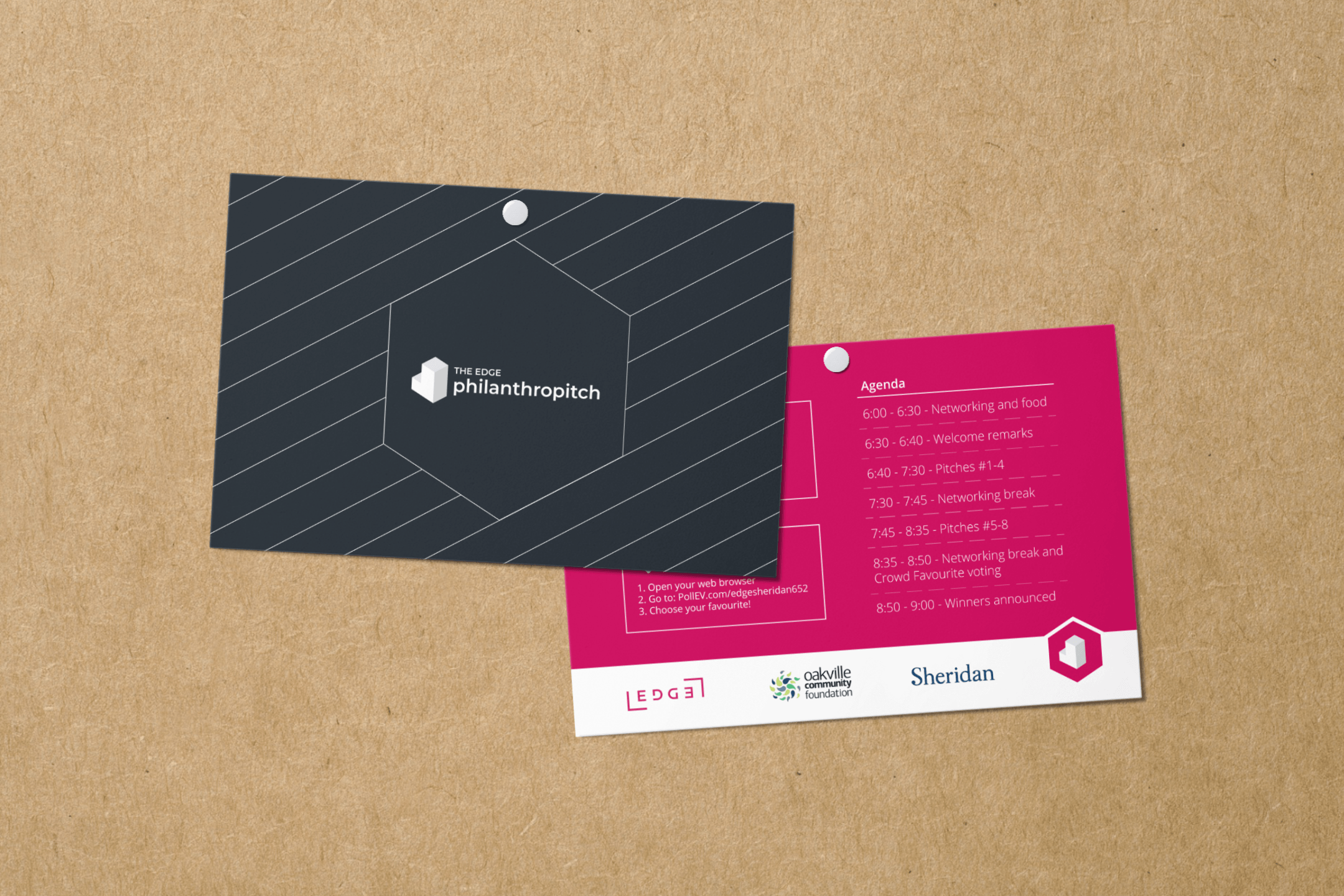
Supporting local entrepreneurs.
The EDGE Philanthropitch was co-hosted and funded by the Oakville Community Foundation, a local philanthropic organization focused on giving back to the community. The goal of the event and its organizers (EDGE & OCF), was to promote and support early stage social entrepreneurs through investments of up to $25,000.
Designing a brand (within a brand)
With The EDGE Philanthropitch, my team and I were faced with a unique challenge; designing a brand for the event that would be easily distinguishable from the EDGE brand, but would still fall within its guidelines, and keep our other external stakeholders happy.
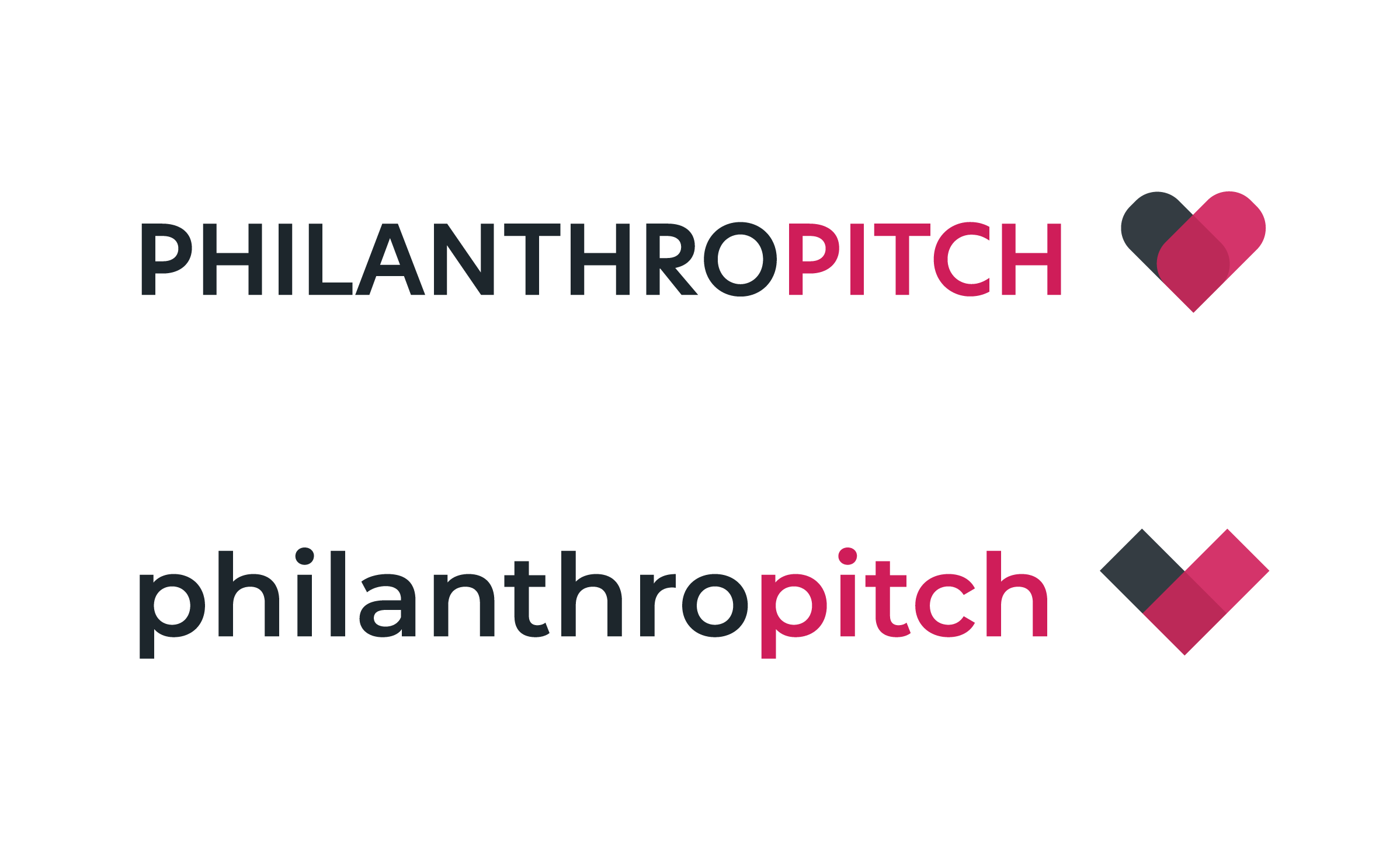
ORIGINAL CONCEPTS

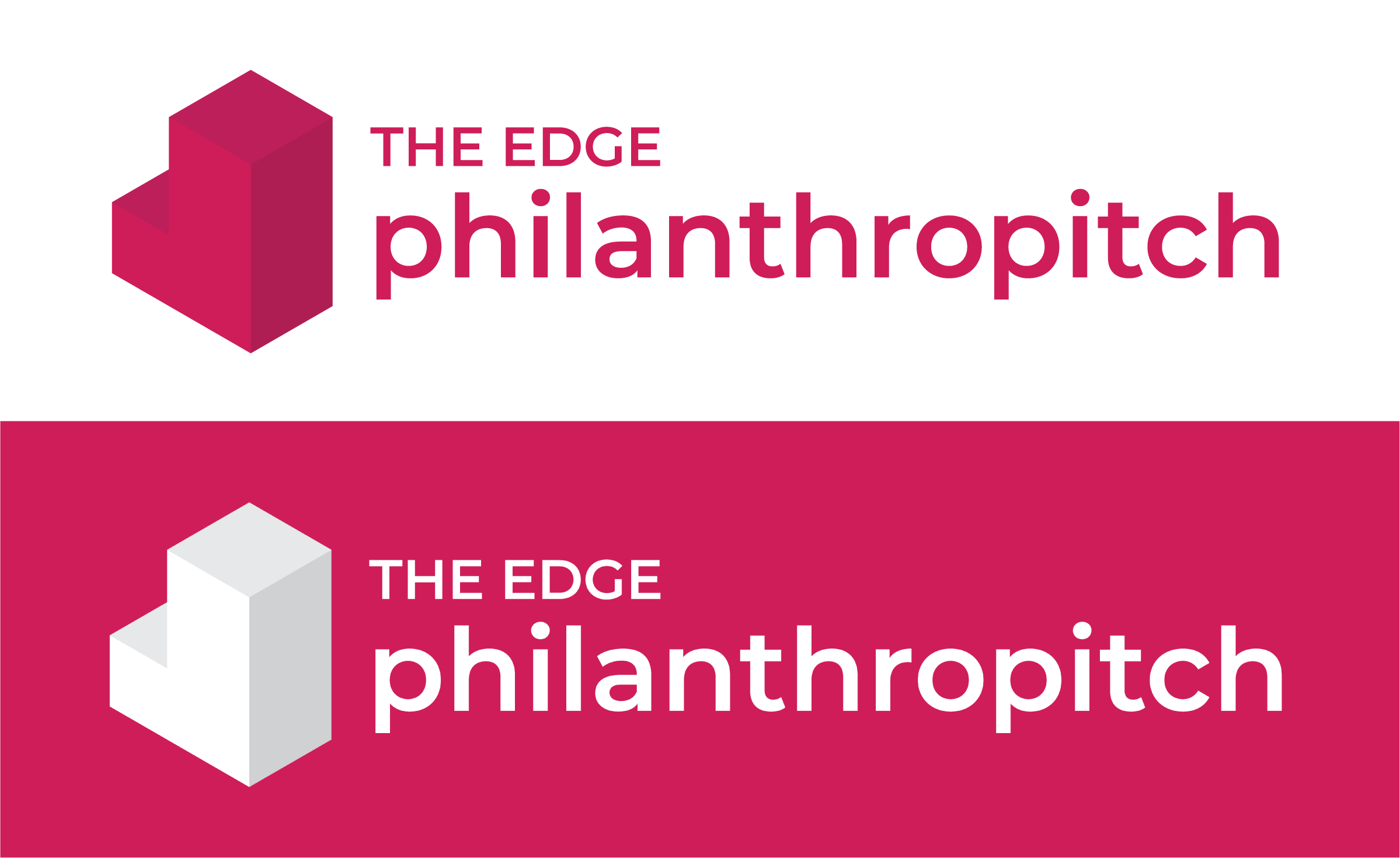
FINAL LOGO VARIANTS
To satisfy the needs of all parties involved, we focused on a common goal between both entities; Their love of social impact.
Given that the focus of the event was social enterprise and community building, many of the logo concepts were centred around building blocks, and the idea of caring about your community. The chosen logo consisted of an icon made up of isometric cubes, and The EDGE Philanthropitch wordmark. The logo was constructed so that the icon could be used on its own for event related communications & promotions.
The final logo brought to life the shared values of OCF and EDGE using EDGE's style.
Prototyping and user testing.
To account for our short deadline (for both the site, and all branding & promotional materials) we opted for high fidelity prototyping and rapid user testing. Our largest hurdle was communicating the necessary information in a quick an efficient way, without missing any crucial details.
Entrepreneurs are busy people.
Most of our target users would be entrepreneurs – a group of people who are known for their ‘always on the go’ mindset, which meant extra effort would need to be made in order to ensure that the information would be quick and easy to digest. During user testing our findings revealed that the biggest hurdle for most of our users was finding specific information such as eligibility requirements and application procedures in the large paragraphs of text.
To remedy this, we focused on reducing copy and making what remained more concise, all while using graphics to replace or complement information wherever possible.
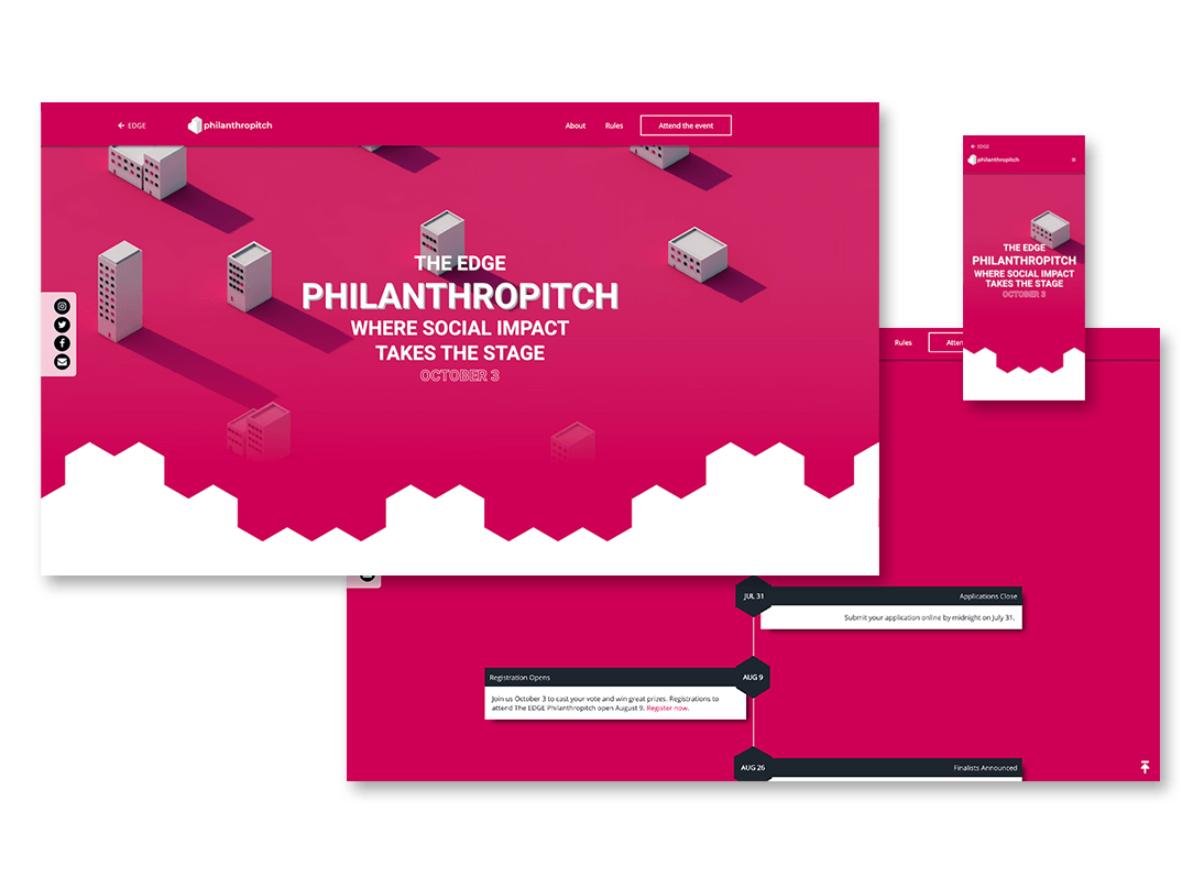
When Building the website we were met with another set of unique challenges.
How does one accurately represent an event of this size on their existing website?
Due to the size and importance of the EDGE Philanthropitch, we were asked to find a way to make it stand out amongst EDGE's many events.
It was initially suggested that we create an entirely separate website from the EDGE site, but with a number of technical limitations and a goal of keeping users within the EDGE ecosystem, we opted for a different solution.
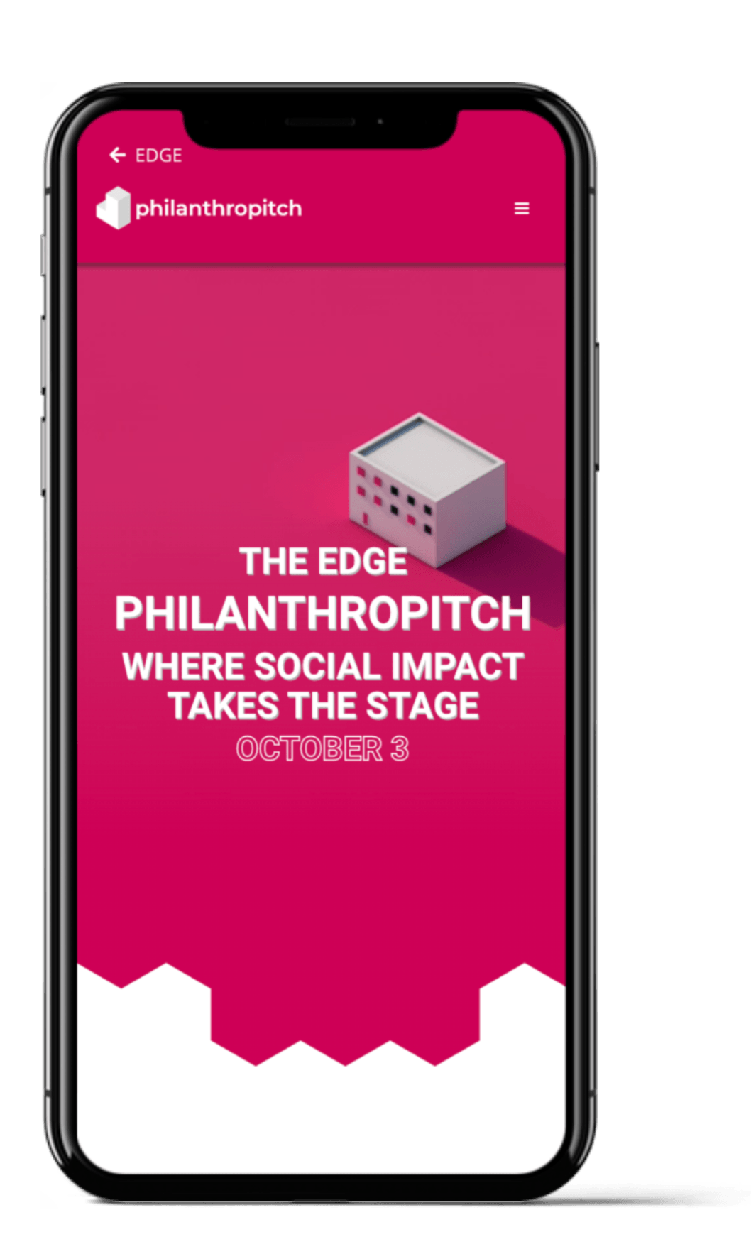
Building a site (within a site)
The solution consisted of creating an entirely new web page, with its own separate navigation menu and back button, which lead 'back' to the EDGE site. To more efficiently track our user metrics, we hosted it under the EDGE domain, and were able to create a seamless user experience for our users.
The result is a visual identity and site that promotes The EDGE Philanthropitch, while still remaining in the EDGE digital ecosystem.
View Site